9 Tips for How to Make Your Website Look More Professional

First impressions last forever. When someone lands on your website, what do you think their instinctive, gut reaction will be?
This is the question you need to answer – as honestly as possible! – to begin the work of making your website professional and optimized for your specific KPIs, whatever they may be.
You only have a very limited amount of time to grab that first impression – less than 8 seconds, in fact – so the importance of getting your website into proper shape cannot be overstated.
When a user visits your website, the first thing they notice is the look (design) and feel (UX). Does your message stand out? Is it easy to know where to click? Are the CTAs loud and clear? A professional website doesn’t just look great – it also performs great, by providing engaging content, helpful links, and smooth navigation so your visitors can find exactly what they are looking for.
If a user enters your site and is immediately turned off by the layout, design, or inability to do what they want to do, your content marketing is doomed to fail. In the blink of an eye, your website can soar – or crash and burn.
So here are 9 top tips that can help you create the website you want to have – and one your readers will love to visit:
What Makes a Website Look Professional?
- Mobile First Design: Make sure to optimize your site for mobile
- Consider Chatbots: Integrate automated chat to drive conversions
- Minimize Loading Time: Reduce page load time and increase engagement
- Custom vs Template Design: Choose the best design option for your needs and budget
- SEO Rules: Make is easy for consumers to find you on search engines
- Don’t Be Afraid of Fonts: Experiment with interesting, eye-catching fonts
- Video Killed the Static Webpage: Boost engagement and conversions with great video
- Background Images Catch the Eye: Make your homepage memorable
- Redefine Simplicity: Keep it simple but make it exciting
1. Mobile First Design: Make sure to optimize your site for mobile
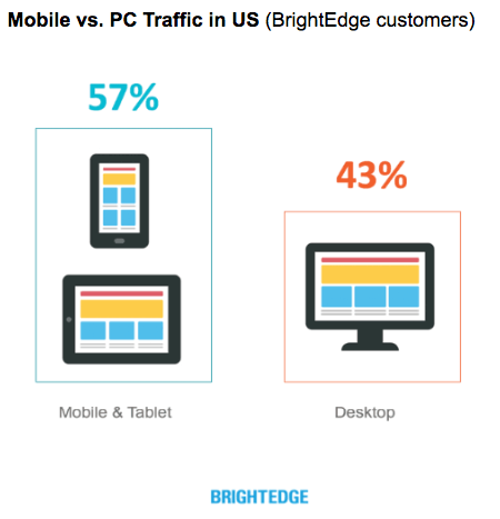
These days, it’s more likely that visitors to your website will be getting there on a mobile phone or tablet. Mobile web traffic has already overtaken desktop, and it’s growing. For website owners, optimizing for mobile is crucial.
Mobile optimization means developing your site in a way that makes it responsive to the mobile platform – that is, the layout and design will be adapted to fit the smaller screen size of mobile devices, and the UX will be comfortable and easy to navigate on a small, handheld device. Making your site mobile responsive is something you need to consider from the outset. It’s important for your mobile site to have the same brand identity and personality as the desktop version, so it pays to design your desktop website in a way that can be easily and comfortably adapted for mobile.

2. Consider Chatbots: Integrate automated chat to drive conversions
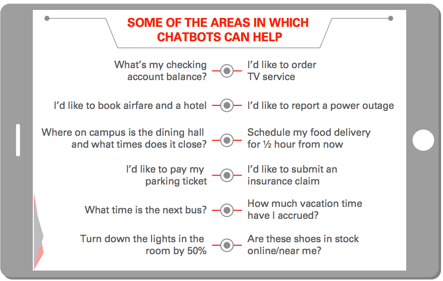
Messaging platforms are already outperforming every other type of app – in fact, 6 of the world’s top 10 mobile apps are messaging apps. So it’s only natural that marketers would begin to take this on board, using messaging technology to provide better customer service online. And the answer is bots – specifically, chatbots, which are automated, artificial intelligence-based chat messaging tools that are already driving higher conversions. When you visit a website that uses chatbots, a small chat window will open on the page, prompting you with questions or a conversation to engage and guide you to what you need. But it’s not a real customer rep – it’s a bot, programmed to give you a great customer service experience.
Chatbots are not just for big business. There are loads of chatbot providers you can use to easily create, customize and implement chatbots on your website. Check out these examples for inspiration.

3. Minimize Loading Time: Reduce page load time and increase engagement
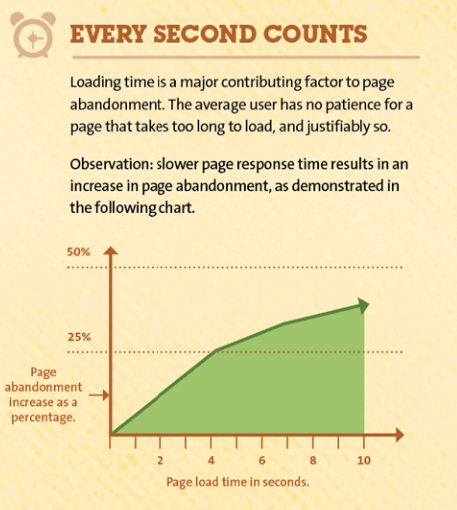
It doesn’t matter how professional your website looks. If the viewer needs to wait 10 seconds for your page to load, you’ve lost them already. The stats are clear: one in two website visitors will leave if the page takes more than 6 seconds to load. Also, slow loading time will negatively affect your Google search ranking, burying your site among lower rankings in search results. Like SEO, loading time will be affected by the page design and programming. There are many ways to improve your page speed, such as optimizing the code, reducing the number of redirects, optimizing images, and more. Check out this quick list from Moz to get more tips to increase your page speed.

4. Custom vs Template Design: Choose the best design option for your needs and budget
One of the decisions you’ll need to make when building or redesigning your website is whether to use a template design or to create your own custom design from scratch. Today, there is an incredible range of website templates and DIY tools that make it easy for even the most inexperienced designer to create a professional-looking website.
On the other hand, when building a custom website, the sky’s the limit. A template-based design won’t give you the complete freedom that you get from custom sites in terms of design, layout, image placement, number of pages, use of unique elements such as custom video and animations, and the website’s overall functionality. However, custom websites are much more draining on resources, including time, manpower – and budget.
At the end of the day, each business owner must weigh the pros and cons of custom vs template design and then decide which is the best for their needs.
5. SEO Rules: Make is easy for consumers to find you on search engines
Okay, so we know that SEO isn’t something you can see, but it is critical to creating a great website experience. Your SEO strategy will determine how easy (or difficult) it is for potential customers to find your website during a search. Don’t make the common marketing mistake of focusing only on your website design; rather, make sure to take into consideration how your website will perform on search engines. After all, what’s the point of having a professional looking site, if no one can find it? So be sure to focus on creating SEO-strong titles and meta descriptions for all your web pages.
Remember, your SEO strategy will have a direct impact on the content and layout of your website, so it’s well worth your time to plan your SEO before you even start thinking about fonts and images.
6. Don’t Be Afraid of Fonts: Experiment with interesting, eye-catching fonts
Sans Serif fonts are free of extending features that may be hard to read on a computer screen. For a long time, website designers tended to play it safe, using Sans Serif fonts to keep a clean look and easy online reading experience. Any font that was too elaborate or busy was anathema to web designers.
But now, with much-improved screen resolutions, designers are embracing the freedom to experiment with exciting, interesting and eye-catching fonts. Serif fonts are making a comeback in website design, and with over 43,000 fonts available for the web, there’s certainly no shortage of font designs out there. Don’t be afraid to experiment with font styles and sizes, and you can even go for underline, highlights, and colorful fonts – all of which are predicted to be hot styles this year. Remember, the font can set the tone for the entire page, so make sure to choose ones that match your company’s style and culture, while being easy on the eye.
7. Video Killed the Static Webpage: Boost engagement and conversions with great video
There’s no avoiding it – Video is king. By 2019, video traffic will make up 80% of all consumer internet traffic. Video marketing is a skyrocketing trend, and it’s no wonder, considering the impressive performance and ROI of online video. Check out this article about the FOCUS video discovery platform. Video ads promoted on Outbrain’s global publisher network got incredible results – 50% of viewers watched the entire video, and the completion rate was 2.7 times higher than the set KPI. (Note: The FOCUS feature is only available in specific territories.)
There’s no question that in these visually-oriented, fast-moving times, video is a highly engaging, high conversion tool, and every professional website should include video as part of the design look and feel.
8. Background Images Catch the Eye: Make your homepage memorable
Most people are visually-oriented learners, rather than auditory or experiential learners. That probably explains part of the reason why 80% of people recall things they see, as opposed to just 20% who recall what they read. This is critical information to keep in mind when planning your homepage design. What kind of background will you use? Will it be a single color tone with a bold heading or an image that catches the eye? Whichever you choose, make sure it is in line with your business’s unique character and purpose.
While we’re on the subject of the power of images, check out this article showcasing the top 10 best corporate websites in 2018: 9 out of 10 have a large image as the background or main feature of the homepage. If this list is anything to go by, then bold background images are definitely IN!
9. Redefine Simplicity: Keep it simple but make it exciting
No one likes a cluttered site – it’s hard to look at, and even harder to navigate. Your website should be kept clean and clutter free, well organized, and great at directing users exactly where they need to go. It’s all a matter of “cognitive fluency” – humans have expectations about how things should be, and when those expectations are met, people are more likely to feel comfortable and content.
When designing your website, try to deliver an experience that your customers subconsciously expect – but don’t be boring! Shake it up a little, and express your brand’s individuality. For example, there’s a new trend coined “brutalism” that gives designers the freedom to blow apart traditional notions of website design and go for something different and rule-breaking.
On the other hand, even a “brutal” design should maintain certain expectations. Links are still links – and they’re placed in obvious eye-catching positions. Hamburger icons can still be used for drop-down menus. Keep it simple, but make it your unique kind of simple. Excite and intrigue your customers while making them feel comfortable and at home.
What’s Your Visceral Reaction?
Here’s another thing to consider: visitors to your website will have an instant first impression that will determine the success of your page. But you also have a visceral reaction to your own website, and it’s important to pay attention to it. Of course, it’s harder to gauge your reaction when you’ve spent hours, days, weeks (or even months!) analyzing every single detail of your website. That’s why you should take a break every now and again, let it sit for a day or two, and then come back with fresh eyes. You’ll be more open to listening to what your gut is telling you. You can also enlist friends, family and colleagues to give their feedback.
And of course, once your site is live, you’ll need to keep an eye on your analytics to monitor its performance, and continually make adjustments to optimize it. But that’s a story for another blog post…
If you’re not a web designer, all of this may seem a little overwhelming. But remember, there is no single answer to great website design. Researching what other people are doing is one way to get inspiration and ideas that will drive the design process. And as long as you’re aware of the elements that make for a well-designed website, it will be much easier for you to work with a designer and achieve the website you want.


