[Publisher Series] Revenue Optimization, Part III: Optimizing Existing Page Layouts

As COVID-19 continues to hurt our global economy day after day, publishers continue to feel the pain. Furloughs are turning to layoffs, newspapers are turning to digital, newsrooms are turning to Zoom rooms.
But, urgency is the new currency, as we’re seeing advertising dollars start to come back quickly across verticals — though given the fluidity of these dollars and how quickly they can disappear just as quickly as they appeared, publishers are being challenged to act quicker than ever before.
Thus, our Revenue Optimization Series continues!
What was first inspired by our very own publisher partnership support has turned into a short-to-long-term blueprint for publishers of all shapes and sizes to take the effects of the coronavirus head on.
Just joining us now? Be sure to check out our earlier articles:
Now, let’s jump into Part three — focusing on the digital home base for all publishers: your website. And how your site layout directly correlates to revenue based on the effects your user experience has on engagement, and further, loyalty.
But, good news — adjustments can be made without a redesign. Let’s dive in.
“Why Page Layout,” You Ask?
Publisher websites are very often intertwined webs, woven over time and across many spiders — or, (not-so) cross-functional publisher departments.
Editorial teams may include polls, infographics, or links to other stories they’ve written. Which may conflict with the Audience Development’s team efforts to recirculate content elsewhere or drive newsletter signups. All in turn may compete with the Affiliate or Native Ad links that the Business Development teams cut deals for. And oh yeah, then there’s Direct Sales and Programmatic teams with numerous ad unit and monetization requests.
Are you as dizzy as I am? It’s no wonder why so many pages are full of “stuff” — much of which may not be fully optimized for short or long-term revenue.
Some publisher sites have so many elements on a page that the reader can barely consume the content — typically visible through loading issues that negatively impact SEO ratings, direct monetization, and user engagement metrics. And in the opposite extreme, some sites have so much blank space between the end of the article and recirculation units beneath them that users never scroll beyond the last sentence thinking there’s nothing else left to explore. Finding the “best” balance requires pure testing and team coordination.
“UXD, Product, Ad Sales, Marketing as well as Engineering teams are working very closely together to provide an advertising experience to users who support the business strategy,” said Uta Knablein, EVP of Design at iHeartRadio. “If a company’s business model is advertising-based, then improving over time the regular revenue management and key metrics (i.e. impressions, clicks, ad-spend, conversions) for different platforms are standard. However, besides those, one can look at additional trending metrics to understand the user’s behavior and preference in order to serve contextually relevant content.”
- Bounce Rate
- Length of Stay / Time On Site
- Scroll Depth
Despite this, most publisher sites still have room for improvement, which we’ll jump into below, breaking priorities down into short and long-term opportunities.
Part III: Optimizing Page Layouts (Without Redesign!)
Short-Term Opportunities
You understandably may not have resources for a redesign, given how much time and how many stakeholder buy-ins it would require. So, here are a few quick fixes that can increase your revenue with minimal development work.
Editorial Units
While we don’t technically advise on Editorial Content, we have seen a handful of Editorial elements negatively impact revenue, such as:
- User Polls or Action Buttons
- Twitter or TikTok Feeds
- Unrelated Content or Video Links
Often, these units negatively impact viewability of the ad units beneath them, thus a bulk of ad revenue with them.
Publishers utilizing similar units in their end-of-article placements should consider implementing such elements more seamlessly within the body of the article, limiting their use. This change alone could increase the revenue of impacted ad units — upwards of 20% to 30% — without sacrificing Editorial integrity.
Audience Development Elements
There are a handful of units we’re comfortable deeming unnecessary for publishers based on majority performance over time. And if they aren’t necessary, there are certainly grounds for removal:
- Social Share Links or Comments — unless your users are heavy contributors, not often seen.
- Category Tags — often go unused.
- Email Share Icons — outdated and do not generate the benefits they used to.
- For example, most people use a phone’s browser settings to share an article — not the share button at the end of the article — but could wreak havoc on your monetization.
Always review your site data to determine if these types of links are generating material value. And if not, consider removing or shifting them elsewhere.
When optimizing for engagement and revenue, every pixel counts.
Ad Units
And just like every pixel counts, every ad unit counts — or else, why utilize them, right?
“To prevent ad prices from bottoming out over the long run, some publishers should reduce the inventory they make available in the programmatic open market in order to keep prices from falling too far and eroding the user experience,” said Tim Peterson, Senior Reporter at Digiday. “That can mean using the ad slots to push internal subscription programs and other internal needs — or simply eliminating the ad slots from pages.”
Each additional ad unit inserted into an article has diminishing marginal returns to the point where the fourth or fifth unit almost becomes worthless.
So, consider replacing below-the-fold, in-article, or in-feed Display ad units with Native, Outstream Video, or Subscription Sign-up units to overturn low performance.
Long-Term Considerations
Have a bit more time to consider less nominal changes?
All roads lead back to the user experience — and back to iHeartRadios’ Knablein’s expertise. “Consumers experience sites with a good user experience very differently than sites that do not pay attention to it.” She continued, “A user arriving to a website that is slow to load, looks inconsistent, and is outdated, will more likely bounce and not convert.”
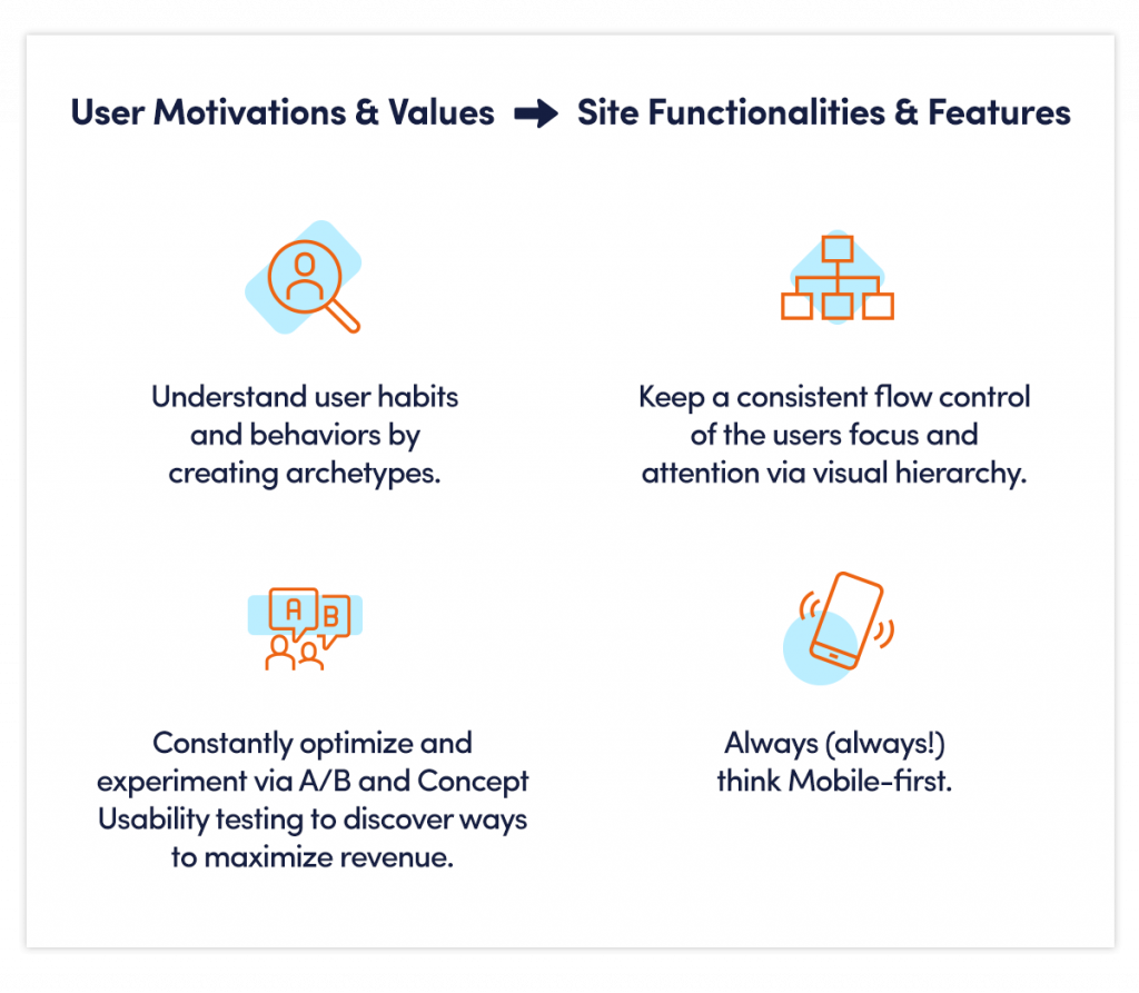
Publisher Design Teams should focus on the motivations and values of products to a user. And once those motivations and values are understood, it’s on Design to marry functionality and features in a consistent, accessible, and aesthetic way.

And as you’re considering a potential redesign, here are the areas you should focus on testing, measuring, and reassessing over time.
Monetization Units
- Control the Number of Display Units. AdSense recommends only placing three Display ad units per single web page. Adding Display units will drive deteriorating marginal returns while sacrificing user experience. Instead, look to add Native, Video, Affiliate, or other monetization units that complement the experience.
- Native Ads Drive Dollars. Native units are taking over a larger piece of the revenue pie, consisting of everything from Branded Content and Outstream Video down to eCommerce and Affiliate links. While CPM-based Display may perform better above the fold, CPC-based Native Ads perform just as well below the fold, within the body of the article, or homepage, and even at the footer — as long as they’re placed within the readers’ content consumption stream.
- Consider Outstream For Mobile. Yes, replace those scrolled-away header ads with Video. “The intrusion factor of Outstream is far lower than with Instream ads, which means Outstream Video creates better emotional comprehension and cognitive imprint in a user, which then could lead to better persuasion and buying intent.” We agree with Knablein.
Layouts & User Experience
- Know Your Audience. This may sound fairly obvious. For example, younger audiences scroll more quickly, particularly on Mobile, as they’ve grown accustomed to consuming news content from social platforms. Mimicking this format could work really well, particularly on your Mobile feeds. So long as your load time is quick enough to keep up, that is.
- Be Logical. Subscription or Email Signups often take away key real estate, especially when they are static as it’s not an optimal experience for users that have already signed up. Instead, use logic to first identify and target only the users you want to convert, and then, find underperforming ad units to replace rather than affecting well-performing ad units.
Audience Segments
- Customize, Customize, Customize. Specific user segments — such as subscribers vs. non-subscribers — or sources of traffic — such as Social vs. Search — should have customized experiences. Not only will this improve the experience for loyal readers, but publishers will extract maximum revenue per user segment, thereby capturing a larger part of the demand curve.
Smarter Revenue? Smart(er)feed.
Alright, alright — so I’m slightly biased, though nonetheless a huge fan of Outbrain’s Smartfeed technology, which addresses many of the publisher objectives and challenges listed above. And candidly, while it’s not perfect, it’s certainly the most productive use of technology we’ve seen in a long time.
The best part? Publishers don’t require any further Development work once the code is on the page.
Here’s what you’re missing (and can achieve with Smartfeed):
- Reduce latency with fewer disjointed ad calls via a single, integrated technology.
- Drive revenue from Outbrain Direct, Outstream and Instream Video PMPs, Native Programmatic Auctions, and from the publisher’s own Direct Sales teams — prioritized to maximize impressions or engagement.
- Enhance page views per session, subscription or newsletter conversions, podcast plays, and comments.
- Leverage dynamic, multi-variable testing that personalizes the experience for maximum revenue or engagement.
And hey, the numbers speak for themselves. Check this out…
- Scripps Increases Direct Revenue by 43%
- Gray TV Increases RPMs Up to 69%
- Digital First Media Lifts RPMs by 20-50%
Winding Down
Poorly designed websites can have a detrimental impact on revenue and the user experience. However, a few simple changes can get publishers back on the revenue track.
Remember, many publishers are allocating time to reassess each and every ad unit, editorial element, and audience development link to ensure the entire page is optimized for short-term revenue and long-term user value. So, don’t get stuck behind!
And be sure to keep an eye out as there are still two more parts to this optimizing series.
- Live — Part 1: Reporting, Data, and Insights
- Live — Part 2: Optimizing Existing Revenue Sources + RPMs
- Live — Part 3: Optimizing Existing Page Layouts
- Coming Soon — Part 4: Optimizing Traffic Sources
- Coming Soon — Part 5: New, LTV-Driven Revenue Planning
Until then, discover how you can manage, control, and monetize your site on the Open Web. Yes, Smartfeed included.


