Landing Page Best Practices: Key Strategies for Higher Conversions

Landing pages are a critical touch point of every marketing campaign. They let you adjust the message to your audience’s buyer journey stage and align it with other campaign creatives. By doing that, you can bridge the gap between the ad and the offer.
You can use them to educate your audience, ask for their email, or sell them a product – all that depending on where they are in the funnel. Because they can serve different purposes, the most successful companies implement multiple landing pages.
Data shows that companies with over 30 landing pages get 7 times more leads compared to companies that use fewer than 10. And, according to research by Hubspot, having more than 40 landing pages can bring even better results! Those often focus on specific segments of their audience.
Of course, the number of landing pages is not the only thing you need to keep in mind to succeed. Remember that quality always trumps quantity.
For a landing page to be successful, it has to follow certain best practices. In this guide to landing page best practices, we’ll look at what you can do to skyrocket your landing page conversion rate.
Here are 14 key strategies for higher landing page conversions every marketer should follow.
1. Create a Compelling Headline
The headline is the first thing people look at when they arrive on your landing page. Its #1 goal is to describe your offer. It should communicate your UVP (unique value proposition) and encourage your audience to stay on the page.
All that makes it the most important piece of text on the entire page.
If your headline fails to grab your audience’s attention, they will leave the page and go elsewhere. As a result, all the other elements won’t matter. On average, only 2 out of 10 people read the rest of the page. But, that doesn’t mean you can’t turn the statistics in your favor.
A compelling headline can significantly improve the user experience. First, it positions you as a serious business that understands its offer and can communicate clearly and effectively. This helps build trust and makes your audience feel more confident.
Here’s an interesting example from Asana. Their headline is clear, targeted, and emphasizes one of the most important benefits of the project management tool:
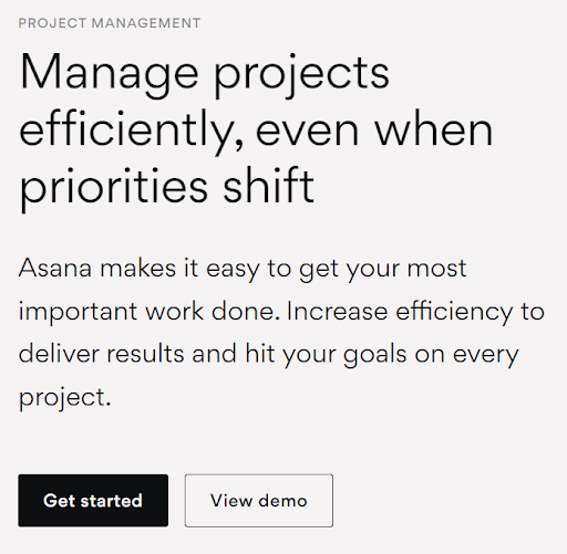
Thanks to that focus, a compelling headline helps your audience determine whether they even need whatever it is that you have to offer. And if they do, it can “pre-sell” your audience.
This, in turn, can skyrocket your landing page’s conversion rate – and that’s just its very first element!
2. Use Concise and Benefit-Focused Copy
Of course, a compelling headline is not the only landing page good practice focused on copywriting. Just because someone stayed on your page after reading your headline doesn’t mean they’re sold.
Thankfully, when it comes to landing page copy, there are a few specific rules following which can significantly increase your chances of conversion:
- Write concise copy – be specific in what it is you want to say.
- Don’t write about yourself, the brand, or the business. Focus on your audience. They want to hear about what’s in it for them.
- If necessary, mention the features of your product or service but emphasize the benefits.
- Separate key information into sections to improve the flow and guide your audience to action.
- Use elements such as subheadings and bullet points to emphasize key points and improve readability.
Speaking of readability, it’s worth looking at the Flesch readability score. It measures how easy your copy is to read compared to texts at different education levels.
Interestingly, one study found that across all websites tested (this includes both landing pages and web copy), 11% of the conversion rate was dependent on readability. However, the readability score had a much higher impact on B2C landing pages than B2B (where there was no correlation).
3. Leverage Visual Elements and Imagery
Even the best website layout won’t do much for your landing page’s readability if you don’t include visual elements.
Images can enhance the appeal of your landing page, break down big sections of text, and help keep visitors on the page.
Of course, there’s more to using visual elements than just aesthetics and giving your audience an opportunity to “take a break” from text.
That’s why simply peppering your page with random stock images won’t help you. It can even make things worse, as your page will look unprofessional and you’ll lose trust and credibility.
That doesn’t mean you shouldn’t use stock images, though – 61% of all landing pages use them. The key is to choose images that are relevant and support your message.
The same is true for videos. An explainer video can increase your landing page conversion rate by 86%. However, similarly to other creatives, it has to be relevant and support people in making a decision.
Of course, you don’t have to try and explain everything in a single video. The video should be short, concise, and laser-focused on key things your audience wants to hear. According to Techsmith’s research, users prefer explainer videos that are between 3 to 6 minutes.
4. Use a Single Call-to-Action (CTA)
The next critical landing page element is a compelling and clear call to action.
After all, every landing page is created with a goal in mind. Whether that’s making a sale, getting a phone number, or an email address, there’s a reason why you created it.
Of course, to get that email, you need to ask your audience to give you one.
You need to encourage them to take action.
Still, many businesses fall into the trap of trying to achieve multiple goals with a single landing page.
As a result, they end up creating several different CTAs, which can distract their audience. Not only that – multiple CTAs may hurt visitors’ decision-making process. As a result, visitors often end up making the only decision they can – they leave the page.
Adding a CTA is one thing. To make it effective, you want it to use action-oriented language and create a sense of urgency:
- The headline and lead-in copy should speak directly to the reader. You can use words such as “Get”, “Try”, “Discover”, or ask a question about the offered benefit.
- The button should tell the user exactly what they’re about to do. Common examples include “Sign up for a Trial”, “Join Us”, “Get XXX (an ebook, a guide, or a report)” or “Try for Free”.
An interesting example of a compelling CTA is that on Aweber’s landing page. Interestingly, even though it’s not time-restricted, including the phrase “one step closer” in the copy still helps create urgency and paint the picture of success that’s just around the corner:

5. Optimize Opt-In Forms
Website forms come in all shapes and sizes and depend on the data that you want to collect. The simplest forms ask about one thing only – most of the time, that’s an email address:
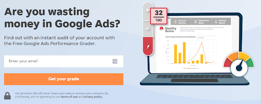
A form with just one field to fill causes the least amount of friction. It’s easy and quick to complete and most people are already used to sharing their email addresses.
Of course, you may need more data than just someone’s email address. If that’s the case, your goal should be to collect only the data necessary, nothing more. The fewer the fields, the better.
Don’t forget that the number of fields is just one of the elements of form optimization. Other elements you want to test include:
- Data privacy policy and ToS links followed by a compelling promise regarding data handling.
- Testimonials or well-known logos from clients/trustworthy companies.
- Certification badges and other kinds of social proof.
In fact, social proof is one of the key landing page good practices in itself – but, we’ll get to that later in this article. Lastly, if you need to collect more data, consider using two-step forms (which often outperform single-step forms).
6. Make the Page Mobile Responsive
While mobile responsiveness certainly makes the list as a good practice, in 2023, it’s more than that – it’s a must. For starters, mobile responsiveness is one of the key Google ranking factors.
But, even if you don’t plan to optimize your landing page for SEO, you will definitely get mobile visitors. If they can’t conveniently browse your landing page on their mobile devices, they’ll likely leave it (and may never come back).
To offer a top-notch user experience, the mobile landing page should be easy to navigate, fast, and secure. What’s interesting is that loading speed doesn’t just impact the bounce rate or conversion. Data shows that pages with a loading time of 5 seconds or less get 70% longer sessions.
Of course, various devices may display your landing page slightly differently. That’s why it’s so important to test them on the most popular devices and operating systems with a tool such as Browserstack.
7. Keep A/B Testing and Running Experiments
Creating landing pages is a never-ending process. Once your landing page is “live” and starts receiving traffic, it’s time to start tweaking it.
In reality, every audience or industry is different. What works for one may completely fail in another. Similarly, you may not come up with all the best ideas right away.
That’s why you want to conduct regular A/B tests to compare different variations of your landing page elements. The key to a successful landing page A/B test is to:
- Always test just one element/change at a time.
- Make sure that you’re driving enough traffic to make the test statistically significant. Interestingly, only 20% of A/B tests reach the 95% statistical significance mark.
- Even if the results of the test seem counterintuitive, they’re probably right (provided you have enough data).
While this landing page good practice may seem pretty standard, it’s also one of the most important ones. After all, collecting and analyzing data allows you to make data-driven decisions. Over time, this may allow you to significantly improve your landing page and find a winner.
8. Include Trust and Credibility Factors
As discussed so far, landing page good practices such as responsive design or clear copy are critical in establishing trust.
But, there are other factors that can make your landing page more trustworthy and, as a result, increase conversion rate:
- Customer testimonials: These are especially effective if they mention how your product or company solved the customer’s problem. Ideally, they should come from a customer who your target audience can easily identify with or someone who’s an authority in your industry.
- Product reviews: These go into more specific details about your product. The better they cover areas of interest (problems, solutions) that are relevant to the visitor, the more effective they’ll be at increasing your conversion rate.
- Case studies: These work great in B2B and allow you to show exactly how your product or service helped solve specific problems or achieve results.
- Client logos: Extremely effective as long as your audience members recognize them. If you get a logo from a well-known company, it can skyrocket your conversion rate.
A great example of how to incorporate the above is Semrush. First, this popular SEO tool features logos from companies such as Tesla, Samsung, Walmart, and Procter & Gamble:
And, as you scroll down the landing page, you’ll come across a testimonial from Brian Dean – one of the most popular SEO professionals and an authority in the SEO industry:
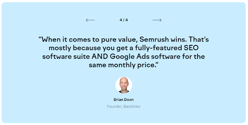
Other tools you can use include security badges, professional organization logos, or certifications. All of them help establish trust and build credibility. However, remember that nothing beats a testimonial from a satisfied client that proves you solved a specific problem.
9. Write a Clear Value Proposition
The next element that’s critical to your landing page’s success is a compelling reason WHY your audience should choose you.
Why should they give you their email address or phone number? Why sign up for your trial offer?
To answer those questions, your landing page needs a clear value proposition. Most of the time, you want to put it in the headline and subheadline right in the hero section of the page.
A good value proposition should be concise and focused on the benefits that are critical to the audience.
In the following example from ActiveCampaign, that UVP is clearly the ability to scale one’s sales team and get more sales.
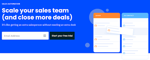
What’s important is that the UVP is a very specific and even quantifiable benefit (“an extra salesperson”). This is a much stronger and more compelling benefit compared to just promising more deals (which, to be honest, many other tools do).
10. Maintain Brand Consistency
When creating landing pages, you want to make sure they maintain consistent branding. This means you want to keep all elements, such as colors, fonts, images, and even copywriting style aligned with your brand.
Ideally, you want your audience to think about your brand the moment they land on the page. A great example of this approach is the Slack customer service landing page (or any of their product/industry landing pages).
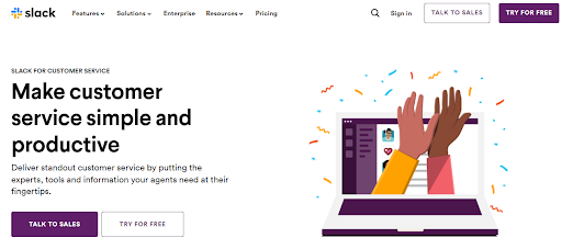
As you can see, they don’t just rely on the logo in the top menu. Everything, from colors to font and images, is aligned with the brand and familiar to someone who’s been checking out their products.
By maintaining brand consistency on your landing page, you get to “borrow” credibility from your brand. And, because your audience trusts you more, it increases the chance of conversion.
11. Consider Adding Social Sharing and Referral Buttons
Whether to implement the next landing page best practice – social sharing – will depend on your offer and the industry that you’re in. Why?
By adding social sharing buttons that encourage visitors to share the page, you increase the chance of getting extra traffic. At first, there seems to be no disadvantage.
And, if you offer an incentive (like a discount) in exchange for sharing, you get a chance to skyrocket the number of shares (and potential visitors).
However, keep in mind that sometimes even removing social media sharing buttons from landing pages leads to an increase in conversion. This will, of course, depend on whether you offer something in exchange, your industry, and even page design.
As always, A/B test your landing page to find the most effective solution for your campaigns.
And, before you make the final decision, take into consideration the total cost. For example, a slight drop in conversion may be outperformed by the increased traffic from social shares.
12. Ensure the Landing Page Is Blazing Fast
You can have the most beautiful landing page on the internet. You can use all the known copywriting techniques and be super diligent about researching your audience. But if it’s bloated, slow, and poorly optimized, its conversion rate will still suffer.
And while the exact numbers differ between tests, all of them show one trend: the longer your website loads, the lower the conversion rate. On average, every second increase in page loading time leads to a decrease in conversion rate by 17%.
Not to mention that if the page loading speed is too slow, most visitors won’t even care to wait for it to finish loading and will simply go elsewhere.
So, how do you improve page speed and loading times? The key things you should take care of include:
- Compressing images: Thankfully, some tools can compress images as they load, without any quality loss.
- Minify code: When using code minification tools, double-check your landing page to see if it’s working correctly.
- Removing any slow, big, resource-hungry elements: These include animations, unnecessary scripts, or graphics.
- If you’re targeting an international audience: Make sure to host your landing pages on a content delivery network. That way, the files will get served from a location that’s much closer to them.
- Leverage caching: This is important to prevent the same elements from loading multiple times from your server.
When optimizing your landing page for speed, always test it with tools such as GTMetrix or Pagespeed. Ideally, you should score for a result similar to the ones presented in the image below – achieved by a landing page by HomeLoanGurus:

As you can see, both its structure and performance were graded highly, with the latter receiving a 100% score.
13. Add a Clear and Transparent Privacy Policy
This landing page good practice is rarely discussed. Yet, a privacy policy isn’t just a nice-to-have thing – it’s actually required by law!
Of course, not everyone is going to read it. But, for those who do, the privacy policy should be clear, concise, and address their key privacy concerns.
You also want to make sure it’s compliant with relevant data protection regulations such as GDPR.
Interestingly, out of those who don’t read the privacy policy, most want to know it’s there. That’s why easily visible links and quick access to your privacy policy have a positive impact on your landing page’s credibility and help you build trust. And, as a result, have a positive impact on your conversion rate! One test showed that including a privacy guarantee increased sign-ups by a staggering 19.47%!
14. Collect Data with Analytics and Tracking Tools
Lastly, once the entire page is done and ready to attract traffic and conversions, don’t forget that you want to measure it all. Setting up conversion tracking and analytics can tell you a lot about your page, including:
- How many people visit your site and who they are
- Where they come from (if your landing page has different traffic sources)
- What’s the page’s conversion rate, bounce rate, and how much time visitors spend on the page
- What are the top traffic sources (if there are several)
- How people are interacting with the page
Collecting data is also essential if you want to implement another landing page good practice – A/B testing. The more data that you get, the more you can improve the page (and, in the long run, improve your marketing campaigns and business performance).
At the basic level, you want to at least use Google Analytics, which is the most popular analytics tool (over 55% of websites use GA). And, if you need a GDPR-friendly solution, you can try one of its alternatives like Matomo, Plausible, or Piwik Pro. Other analytics tools worth implementing include heatmaps and behavior analytics such as Hotjar.
Start Building Landing Pages that Convert
Landing pages are a key element of online marketing campaigns. If they are well-built, they can skyrocket conversion rates and help you get the most out of your marketing budget.
Yet simply following all these landing page best practices is not enough to succeed.
To get the most out of your marketing budget, you need to tailor each of the points discussed to your specific situation. This means taking into consideration your industry, target audience, and marketing goals.
And, of course – don’t forget to keep A/B testing your pages one element at a time!


