4 U/X Factors to Consider for Better Travel Blog Post Results

At its core, your travel blog aims to provide value to readers.
You might position yourself as a resource for facilitating research and education, or by becoming a channel for entertainment on all things related to the travel industry.
But, as all content marketers looking to engage online their audiences know, that’s a lot easier said than done, especially in a hot vertical such as travel.
Because beyond our motivation to drive inbound leads is the perspective of the audience who consumes our content and what that experience is like for them.
So, we do our best to produce higher-quality content that answers a reader’s question, inspires a dream about a specific destination, or simply drives them to share with their network of family and friends online.
Again, not always that easy.
You see, there are a few other things you need to consider in order to keep readers interested, engaged, and empowered enough to take your content and do something with it.
*Coughs* Convert *Coughs*
As the CEO/Co-Founder and primary blog writer for the Social Garden blog, I’ve learned a few things about creating blog content that works.
Here are my 4 tips for using a better approach to UX for blog post creation:
1. Design with Content in Mind
A great way to ensure an aesthetically pleasing design for blog your content is to focus on balance and symmetry.
Consider the flow and experience of the following visual elements:
- Graphics and visualizations
- Photos and videos
- Infographics
- SlideShare decks
- Embeds
- Sidebars and banners
- Written text
Making sure to balance written content with media, you want a repeatable flow that doesn’t leave too many wide open spaces, over utilize too much space, or distract the user from completing the piece of content.
Users are expecting your page to be consistent and feel natural.
Here’s a great example of how Brit + Co sets up their content, and specifically, creates the most engaging experience on this travel piece:
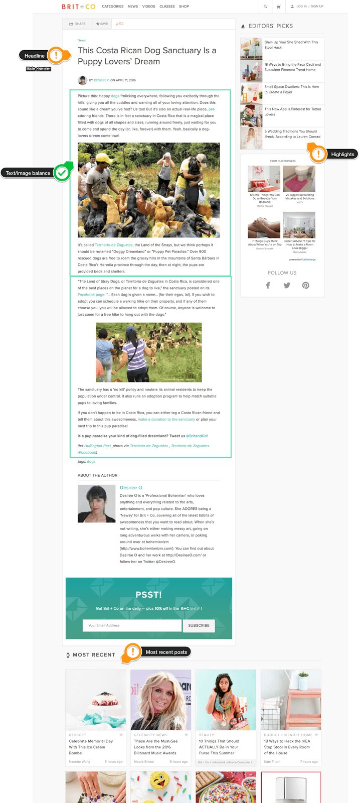
Users can easily navigate the content, allowing them to both inform readers and capitalize on reader engagement through the use of high-quality media and sharing accessibility.
2. Readability of Article
If visitors are clicking into your blog but quickly abandoning it, you most likely have a readability issue. This means readers are struggling to comprehend your content or it just isn’t digestible enough to keep their attention.
This could be due to a range of reasons, including syntax, vocabulary, design, weighty media files, and even heavy text blocks.
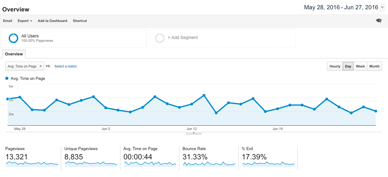
Thankfully, Google Analytics is a fantastic tool for understanding how readers are navigating to and around your blog.
|
|
From here you can look up the Avg. Time on Page for each of your blog posts.
If the average reader can read around 200 words per minute, your post of 1000 words should produce an average of 5 minutes of reading time.
Numbers significantly less than that could mean they’re dropping off before finish the article.
Even if your blog’s content is well designed and balanced, readers will quickly disengage with your blog if it is difficult for them to read. Nielsen Norman Group found that 79% of people are known as ‘lazy readers’ where they hardly read and mostly scan.
You can use this as motivation to vastly improve the readability of content on your blog.
Here are seven quick tips to implement for better readability:
-
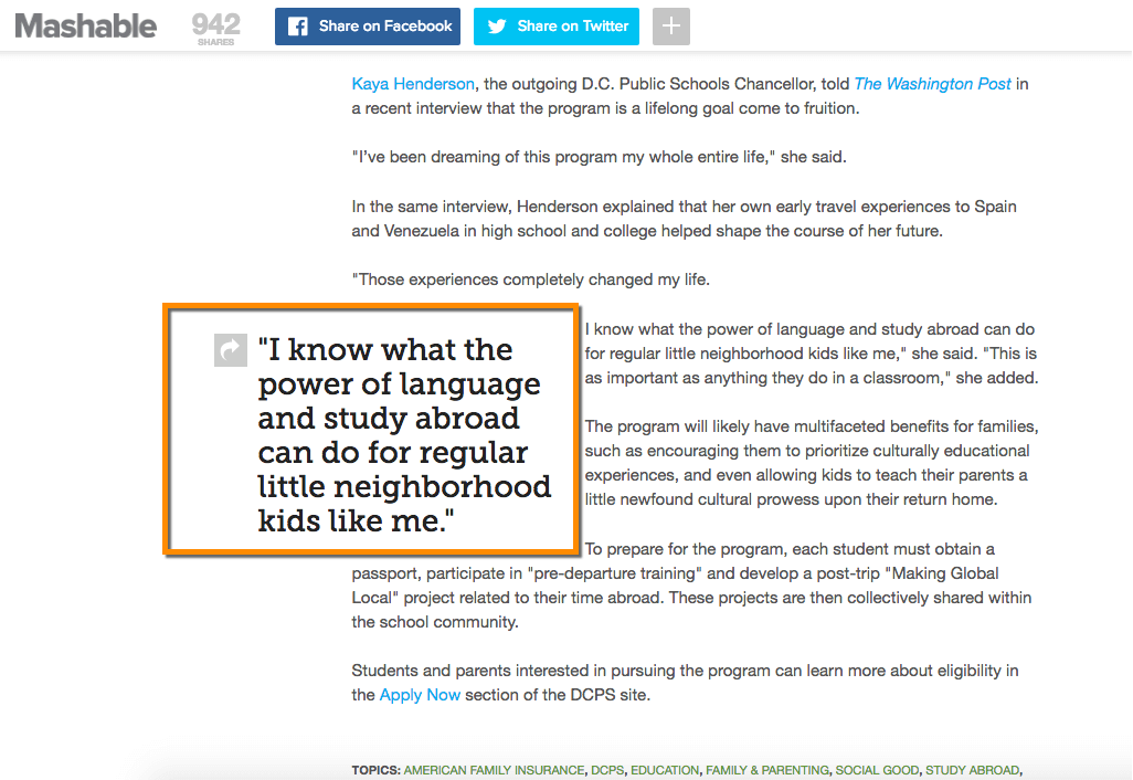
Use subheadings to catch readers during scanning mode or highlight key points you want to communicate from within the article whilst creating curiosity, like Mashable does:
|
|
-
Test your readability score. This will give you an idea of where you can improve in regard to your use of words, syllables, and characters. Text which scores 60 to 80 is considered easy to read.
-
Summarize important points in short paragraphs to break up any bulky text.
-
Use visual variety to add meaning to text throughout the content.
-
Use connective words (first,’ then,’ now,’ for example,’ however,’ etc.) to help guide the reader through sentences and paragraphs.
-
Look into increased line spacing between bulleted lists, numbered lists, lines, and paragraphs.
-
Consider font legibility, weights, styles, and avoid small fonts on all devices, especially for long-form copy.
These techniques will enhance the readability of any article, ensuring visitors can read and understand the solution or end goal you are trying to communicate without quickly abandoning the page.
3. Better Popup Experiences
Creating popups can be tricky business — they inherently interrupt the visitors experience the moment they appear. But according to research from Shopify, popups have proven time after time that they are great drivers of lead generation.
That is if they’re good at what they do.
Here’s a great example from Atlas Obscura:
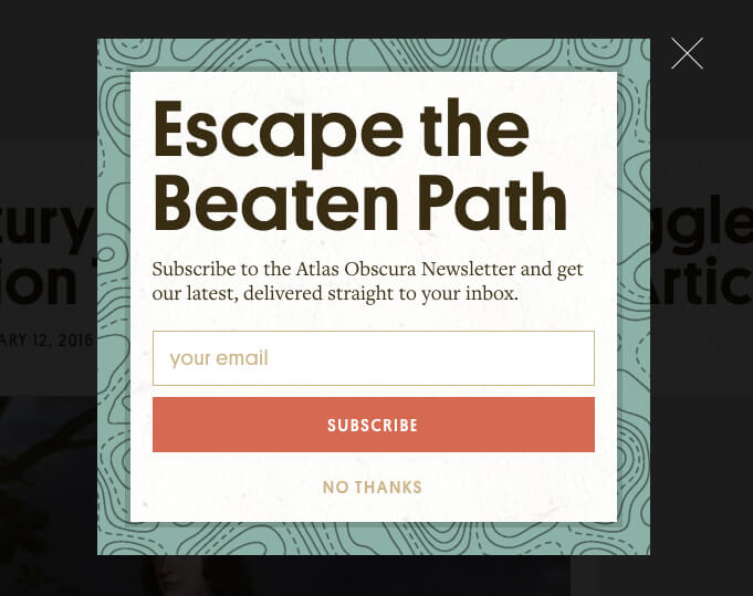
In order to properly utilize popup content without distracting or detracting from the user experience of your audience is to figure out what type of popup works best them:
There are several types of pop-ups available to you:
Timed-Based – This configuration will show your popup after a predetermined amount of time. A time-based popup can work well if you set it to 60 seconds or greater, better qualifying visitors who have been more engaged with your site content.
Content-Based – These pop ups will only show on specific pages, allowing you to create highly-curated opt-ins on relevant pages.
Scroll-Based – Show a popup when a user has scrolled a specific percentage of the way down your page. This is commonly used on blog posts and is similar to the timed method, allowing you to better trigger the experience based on a user’s engagement.
Exit-Intent – Capture a visitor who may be about to navigate away from your site. Using cursor tracking, the popup app will determine when someone is about to click the back or close button on their browser, showcasing your popup in as a “FOMO” tactic for retrieving an email address before the visitor leaves your site.
Here’s how Condé Nast Traveler incentivizes audiences on their way out:
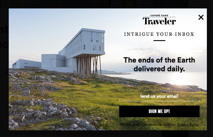
No matter what type of pop up experience you choose, if you focus on including relevant content during carefully selected moments in their content journey, you will not only enhance user engagement but will also increase conversions.
4. X buttons (Close out)
Have you ever experienced a pop up on your mobile phone, went to click out of the window, but accidentally clicked into it because the ‘X’ button was too small?
It happens all the time and destroys the user experience more than you would imagine. Well designed, well placed, and easy to press X buttons on both mobile and desktop platforms are incredibly important.
UXbooth explains how deeply ingrained it is within our survival instincts to want to feel in control of our environments. There is no difference with how we operate when consuming content online.
Here are some easy ways to allow users to feel in control on both mobile and desktop:
- Create X buttons that use spacial awareness
- Position the X button so that it draws attention and visibility
- Colorize the X button in a way that communicates it will complete the desired action
- Allow the user to simply click off of the popup, closing the experience at their liberty
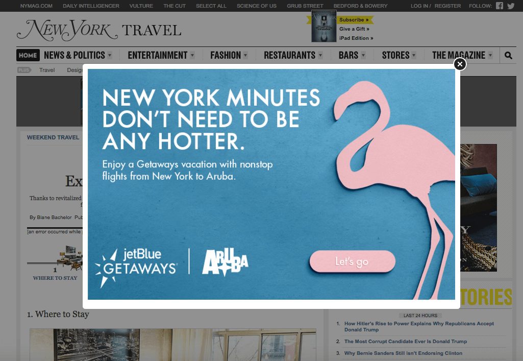
Check out how New York Magazine makes it incredibly simple for a user to navigate outside of the content:
|
|
Conclusion
Today’s user is increasingly looking to blog posts as a form of diverse information in which to answer important questions or to spark a consumer’s interest about a specific destination or adventure.
This means they must be compelled to read, engage, and navigate your content.
Whether you want them to complete an entire article, share the post with their network, or subscribe to your mailing list, using some of the subtle but powerful tips above, you will be able to evoke the desired response of your audience.
Do you have any great tips for increasing user experience on page? If so, I’d love to hear them. Feel free to share in the comments section below.


