5 Data Visualization Lessons for Creating Winning Infographics
Introduction
It’s clear that brands have fully embraced the power of visual content, and today, the infographic seems to be at the top of its game.
After all, our thirst for visual content seems to be unquenchable.
Don’t believe me?
Just take look at this chart, which shows global Google search interest from 2010 to March 2016 for the terms ’infographic’ and ‘content marketing.’
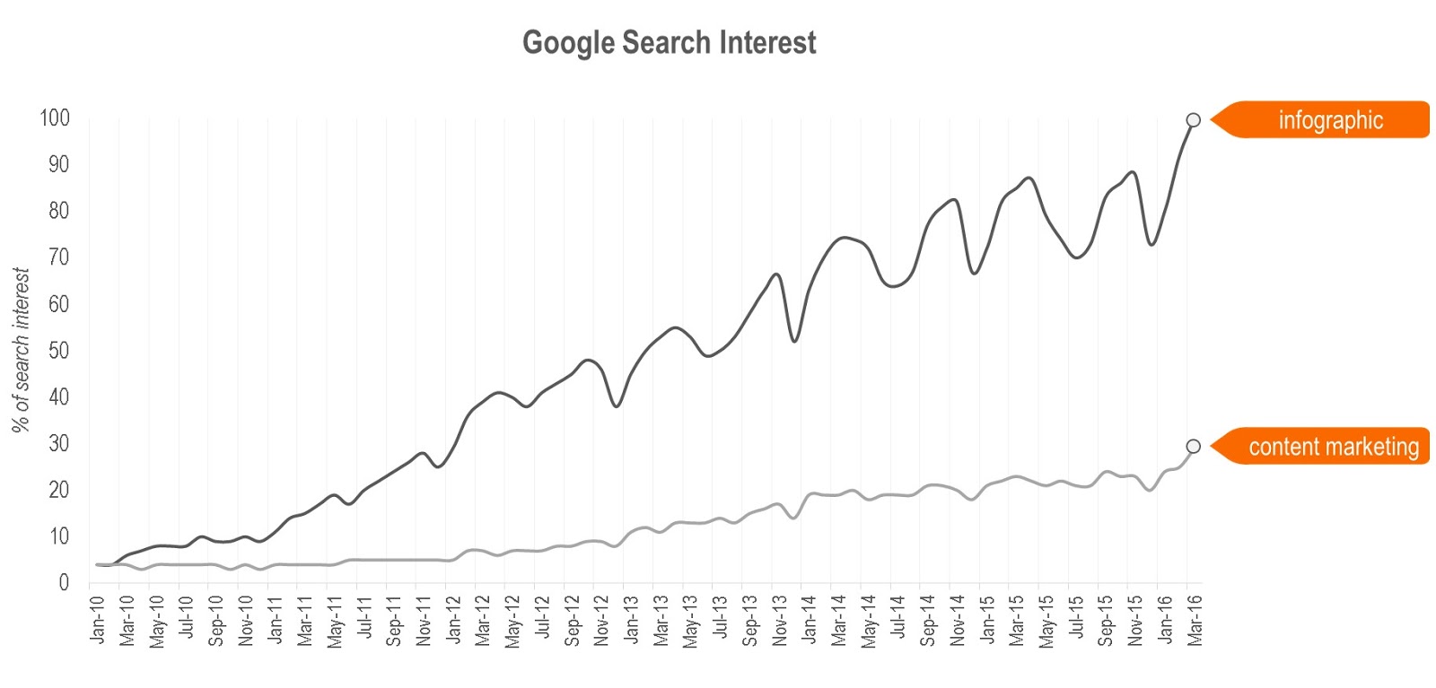
Fun fact, search interest for “infographic” reached its historical peak this month!
What’s really fascinating is how the industry has responded and evolved to support visual content, specifically infographics.
Over the last 2 years we’ve seen more and more creative and communications agencies adding info and visual graphics production to their portfolios, we’ve seen a host of new startups and technology players emerge who offer self-serve design and production, and we’ve even seen creative marketplaces rush to add infographic templates and design packs to their catalogue.
All of this has made infographic design and production more accessible.
Which is great.
However, I often come across infographics today that are created without consideration for basic data visualization and chart formatting rules. Poor design choices and formatting errors can cause confusion, frustration, or worse, they can result in your audience completely misinterpreting your message.
Not all infographics are packed with charts and data. Some are created to visualize long-form content or complex ideas while others offer their readers a timeline of events, a comparison or even a tutorial.
But if you are creating an infographic that visualizes data in any way, be it through standard charts or custom data visualization, it’s important that you follow a few basic rules.
Today, I’m here to share 5 data visualization tips that will help you plan and design winning infographics that are both beautiful and effective in communicating your message.
I’ll be drawing on a few infographic design gaffes to illustrate my points.
This is in no way intended to poke fun at the authors of the graphics. The mistakes I highlight below are common enough that anyone could make them. The goal is to learn from these mistakes so we can all become better visual storytellers.
1) KNOW your data
>A lot of the infographic data viz mishaps I spot are usually due to the author not being familiar enough with the data set they used.
You should have a solid grasp of your data, where it came from and how it is structured to make sure you represent it clearly and accurately in your graphic.
Otherwise, small mistakes here can have a big impact on your audience’s’ ability read, interpret and draw meaningful conclusions from your infographic.
Example
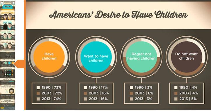
The image below is a snippet from an infographic about American lifestyle, living, and household trends.
(Source: The Rearranging of Americans’ Living Arrangements)
What’s the problem?
In the above graphic, you can see 4 separate pie charts, each showing us data related to a desire expressed by the American population (i.e. % of those have children, want to have children, etc).
Below the pie chart is a legend which tells us that each color-coded donut slice represents a year (i.e. 1990, 2003 and 2013).
The data label is also included in the legend, which is the first sign that something is amiss (data labels should be on the chart itself).
The core problem with these pie charts is that the data for 1990, 2003 and 2013 aren’t part of a single whole value, and therefore, cannot be plotted in a pie chart. Pie charts are used to visualize composition, and by plotting the data this way the author has unintentionally changed the meaning of the data.
To illustrate this (below,) find a graphics recreated with data labels that show the charted value of each donut slice.
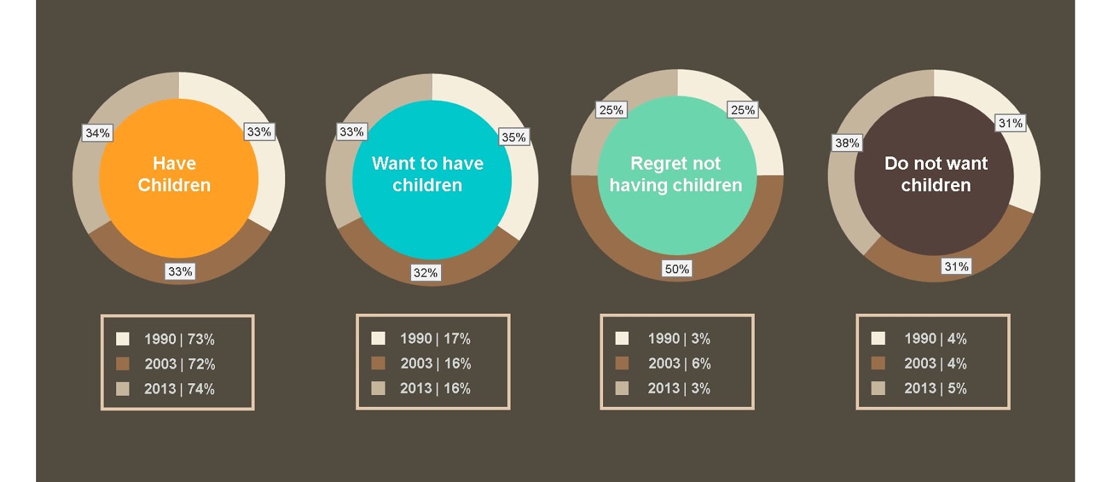
You could argue that the author has simply chosen the wrong chart to visualize their data, and wouldn’t be wrong.
But the real reason this happened was that the author didn’t have a firm grasp of the dataset and how it was structured.
For example, a pie chart would actually work here if the data series was inverted so each chart represents a year and is broken down by the desire states, instead of the other way around.
Here’s an example of what that would look like.
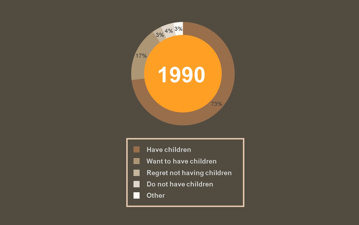
Note: I’ve included the ‘Other’ category because the 4 desire states don’t add up to 100%. This is another issue that I’ll cover later (see section 4 – Tell the WHOLE story).
Takeaway
If you’re working with primary data (data that you created) make sure you involve one of the original researchers in both the creative storyboarding and final graphic reviews as they should be able to catch minor errors like this.
If you’re working with secondary data (data that was created by someone else) make sure you familiarize yourself with the dataset as much as possible before you start designing.
Make sure you can answer and understand the following questions:
- How was the data collected? (e.g. poll, census, etc)
- What metrics, data formats and units of measure are included?
- How is the data structured? (e.g. by date/time, by category, etc)
- How granular is your data set? (e.g. broken down by day, month, year, etc)
2) Choose the RIGHT chart
Sometimes infographics fail to resonate because the author simply chooses the wrong chart (or charts) to visualize their data.
Using the wrong chart to represent your data can make your infographic both confusing and frustrating to read and it’s a simple error that you should never make.
Example
The image below is a snippet from an infographic which offers insight into millennial dining trends in relation to everyone’s favorite meal, brunch.
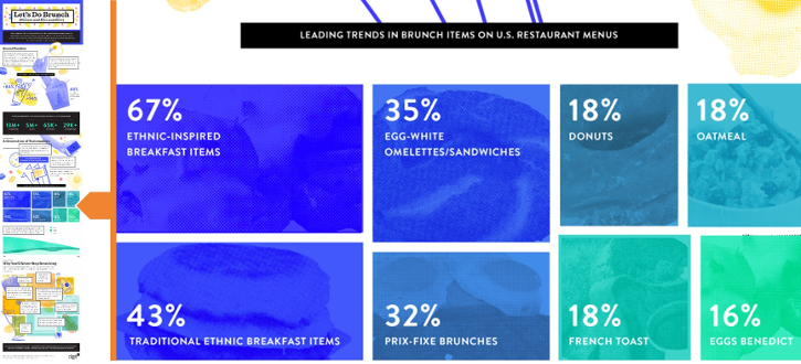
(Source: Let’s Do Brunch (Forever and Ever and Ever))
What’s the problem?
The image above is what’s known as a treemap, which is typically used to visualize hierarchical data through nested tables and color coding.
Treemaps work well when you have a dataset that has a complex organizational structure with many sub-branches.
Here’s a great example of a treemap map produced by the New York Times which breaks down President Obama’s 2011 budget proposal
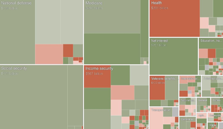
(Source: Obama’s 2011 Budget Proposal: How It’s Spent)
The data presented in the brunch infographic isn’t hierarchical, and therefore, a treemap wasn’t the right choice.
There’s also a minor issue with the way the graphic was constructed.
Notice anything odd about those 3 boxes on the right of the graphic labeled 18% (i.e. Donuts, Oatmeal and French Toast)?
They don’t appear to be equal, and it would seem that the designer manually created these graphical elements by hand, which is a big no-no when it comes to data visualization.
Takeaway
Always ensure you choose the right chart that enables you to accurately and meaningfully present your data.
The good news is you don’t have to be a statistician or data scientist to understand the basics.
The folks at Qlik have created a really handy resource which helps you select the right chart based on what you’re attempting to show (i.e. distribution, composition, comparison, etc).
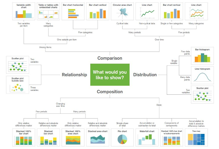
Also, when constructing your charts don’t ever eyeball scale, proportion or distance.
You can easily create statistically accurate graphics in Excel which your creative can then polish up in a program like Photoshop or Illustrator.
If you create charts manually by hand you run the risk of misrepresenting the data which can confuse the reader, or worse, change the meaning of the graphic entirely.
3 – Make your charts INTUITIVE
Last year, Time magazine reported that the average attention span for someone online is 8 seconds.
As a brand, this means that you don’t have a lot of time to catch and keep the attention of your audience.
Your charts and graphics need to be simple, intuitive and easy to read so the reader can quickly draw conclusions.
If it’s too hard to understand, your infographic will just get lost in the fray.
Example
The image below is a snippet from an infographic about the “latest statistics and trends about Jingdong (JD.com),” a leading eCommerce website in China.
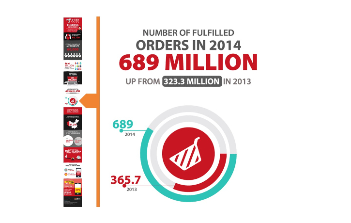
(Source: Jingdong in Numbers)
What’s the problem?
The graphic shown above is a radial bar chart which depicts the rise in online order volume for JD.com between 2013 and 2014.
I find radial bar charts tend to be used more for their visual appeal rather than any practical use, so be cautious if you decide to use one.
Radial charts require important visual cues in order for them to be easy to read.
Take this one for example:
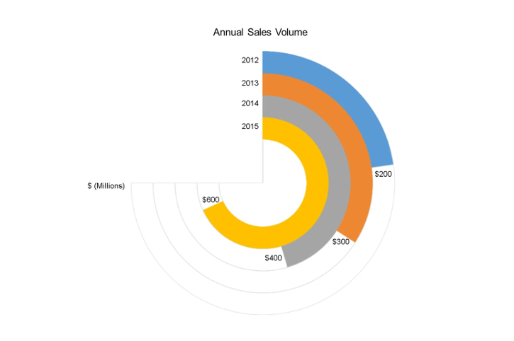
In this chart, (Annual Sales Volume) you can see a clear start and end point for all four data series. Also, note how the rings in this graph don’t go a full 360 degrees.
Going back to the JD.com radial bar chart, it’s hard to know where to begin. It’s not very clear, but the area where the 2 colors align across both rings is the starting point (i.e. January of 2013/14).
It would have helped to have a design cue signaling the starting point.
But the biggest issue here is definitely the 360-degree ring.
The data represented here is volume based (i.e. orders fulfilled), but the 360-degree ring implies that the data is a composition of something (e.g. % of total orders). It can be confusing when you look at it because the ring suggests there is a maximum number of orders that could be placed (based on the scale and values in the chart, it looks to be around 1.2 billion).
Takeaway
Your audience shouldn’t need to spend a great deal of time unpacking your design choices and interpreting your data.
Simply put, you charts and graphics should be intuitive.
Before sharing your infographic with the world trying conducting a readability test among a test audience.
Start by recruiting a few people in your office who know absolutely nothing about the infographic or dataset. Sit them down individually and show them the infographic for 10 seconds.
If it’s a long infographic, break it down into sections and show them each section for 10 seconds.
When the 10 seconds is up, ask them 2 questions:
- What was the underlying dataset about?
- What conclusion or conclusion(s) did you take away from it?
If anyone (even just one person) didn’t understand what the data was about, you need to rethink your design.
If their conclusions are not aligned with your intended message or their conclusions are wildly different from your test audience, you’ve got more work to do.
4 – Tell the WHOLE story
The accuracy of your data and how you present it is directly linked to the credibility of and trust in your infographic, and perhaps even your brand.
Therefore, it’s very important that you vet the accuracy of the data you use, and that you represent the data accurately in your infographic.
Example
The image below is a snippet from an infographic which provides demographic and economic information about the U.S. city of Bonaire Georgia.
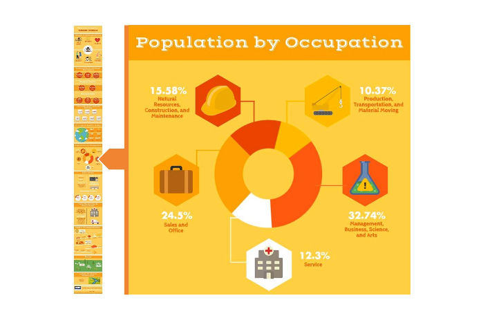
(Source: Welcome home to Bonaire Georgia)
What’s the problem?
At first glance, you can see that this is a simple donut/pie chart showing the population breakdown of the city by occupation.
But if you take a closer look at those numbers you’ll see that they don’t add up to 100%.
There could be a number of reasons why this has happened, including a) the data is wrong, b) data was omitted (i.e. there are other occupation categories that we’re included), or c) the designer took some liberties with rounding the data.
Whatever the reason, it should never happen.
Sure, not everyone is going to scrutinize your data to make sure it checks out, but some will.
A minor mistake like this can call into question the credibility of your entire infographic.
The folks over at Venngage covered this issue in a great post about what makes infographics successful.
They believe that exceptionally good content needs to be Practical, Entertaining, Awe-Inspiring and Credible (P.E.A.C.).
They go on to say that:
“If you aren’t creating content that is backed up with well-researched and concrete proof, you risk tainting your own credibility.”
Credibility is important because, unlike some of the other gaffes we’ve covered, this issue can actually impact your brand’s’ reputation.
Takeaway
If you’re using data from secondary research make sure it comes from a trusted and credible source.
Furthermore, always include links to your data sources at the bottom of your infographic. If the data was collected through primary research, include a short statement about your methodology.
And finally, double and triple check your charts and data during your final reviews.
Mistakes can happen.
A 1 can become a 2, a decimal point can be placed in the wrong location, or a chart can be incorrectly scaled.
This is exactly why your internal reviews are so important.
5 – Don’t MISREPRESENT your data
Data is beautiful enough as it is, so you don’t need to go messing things up by swapping out standard chart elements with other graphics.
That’s not to say you shouldn’t format your charts to make them look stunning.
Rather, you should never design a chart in a way that needlessly distracts or confuses the reader.
Example
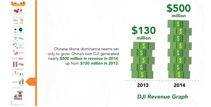
The image below is a snippet from an infographic about consumer drone manufacturing and industry growth in China and the U.S.
(Source: Will China or America Win the Consumer Drone Manufacturing War?)
What’s wrong with it?
The graphic features a bar chart which shows us year-over-year revenue volume for a Chinese drone maker, DJI.
However, the author has swapped out the standard bar elements for stacks of cash to make the graphic more visually appealing.
The problem is that the stacks of cash look like a unit of measure, and your audience might see something like this and ask, “do the individual stacks of cash have any meaning or relationship with the actual data.”
The fact that there are 5 stacks in 2013 and 8 stacks in 2014 has nothing to do with the total revenue for each of these years, it’s an unnecessary design feature.
Another problem with this graphic is that the y-axis has been adjusted in a way that the author has unintentionally downplayed the visual impact of the growth in revenue.
The y-axis baseline in that chart isn’t 0, if it were it would look something like this:
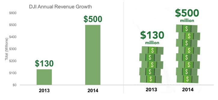
The y-axis scale presented in the money stack graphic on the right has been adjusted so the baseline starts higher than 0, making it look like the difference in total revenue between 2013 and 2014 is much smaller.
There is much debate over whether y-axis baselines should always be zero (Vox make a good case for why it shouldn’t).
But regardless of your stand on y-axis baselines, this graphic is problematic because the design choices (i.e. the money stacks and y-axis baseline) impact the audience’s interpretation of the data.
Simply put, the visual tells a different story than the actual data.
Takeaway
Try to avoid swapping out standard chart elements with graphics (e.g. money stacks).
If you want to make your charts look beautiful, there are lots of different ways to do this.
Creative marketplaces like Behance.net, Envato market and Creative Market.com sell beautifully designed chart elements for infographics and these are great places to go to either purchase design packs or just to get inspired.
Also, aside from design aesthetics, be careful when formatting charts and adjusting scale and axis.
Always consider if adjusting a scale or axis will impact how your readers interpret the chart, and if so, how?
If you’re not sure you’ll need to consult with someone who does, such as a digital analyst, statistician or a researcher who specializes in quantitative.
If you interested in training up yourself, a great place to start is this great resource from Nathan Yau, which is packed with helpful chart formatting tips and rules for beginners.
Conclusion
Having a firm grip on basic chart formatting and data visualization best practices and rules can go a long way in helping you plan and design great visual content.
More importantly, mastering the basics will ensure you don’t make errors that could have a negative impact on the delivery of your core message.
Overall, communicating through data is as much an art as it is a science.
A firm handle on data visualization design principles can be the difference between an infographic that generates a few shares and one that actually resonates with your audience and which generates measurable impact for your brand.
For tips on generating tons of traffic with an infographic, check out this article from Nadya Khoja of Venngage.


