UX in Copywriting: Copy from an Experiential Point of View
Good copywriting is about creating an experience with only the letters in the alphabet and the space on a page.
Despite their apparent simplicity, these two tools are incredibly powerful, and have been put to great use since the genesis of the written word. In recent years, however, the medium through which copy is delivered has shifted, and the way that audiences consume content has changed. In other words, the user experience of reading has completely evolved.
As much as copywriting is about creating engaging content, there is an increasing need to consider audience’s online experience in order to fully engage them.
The internet is a fathomless sea of content — much of it written — that is ever-growing and evolving at an exponential rate. Ensuring your content breaks through the clutter has never been more important, nor more competitive. An excellent way to do this is by considering your copywriting from a UX perspective.
UX in Copywriting
What is important to remember when implementing the concept of UX into copywriting is that one size doesn’t fit all.
Every publisher of content, from a music publication to Time Magazine, has different goals, different values, different motives, and most importantly, different audiences. This will have a huge impact on how you orchestrate your user experience.
So, let’s get into some of the ways in which you can adopt a better approach to copywriting for your readers…
Language and Style
Understanding your audience is an integral part of copywriting. The language you use should reflect your target audience, as well as your brand. And although this should come naturally, it is important to occasionally take a step back and look at the bigger picture; to read your own copy with a little perspective.
Language is acrobatic, flexible, it’s ductile and impressionable. It is putty in your hands, ready to be molded in whichever way necessary.
Formal & Technical
Good copy needn’t be university-level writing or poetic prose, it is whatever the user needs it to be. Stiff, pragmatic language may be lifeless, but for instructional text like how-to guides or a product instruction manuals, it is the most effective way to ensure the reader can easily access the information at hand.
Take for example an support guide on the Apple website:
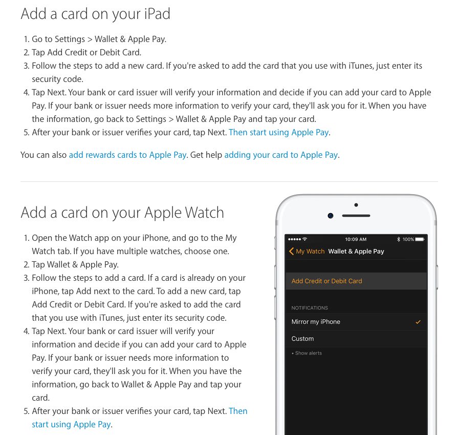
On the flipside, this kind of writing isn’t all that engaging, but is rather serving a direct purpose, i.e. helping the user complete a task with as much ease as possible.
The key premise behind UX is accessibility and the transference of information — ensuring the user connects with the system. However, in copywriting terms, this may not always mean access to information, but rather an emotional connection, as well. Which brings us to another user-friendly approach to copywriting…
Conversational
Conversational copy, or inclusive copy, is an extremely persuasive writing technique as it elicits an emotional connection between the writer and the reader. The key here is conversational tone, much like a vendor talking face-to-face with a customer.
Inclusive words like “you” and “me” and “us” are fantastic emotional conductors that draw a reader in, asking them to engage on a more personal level, which can be a really powerful way to get a message across.
Take for example an excerpt from a newsletter from Backlinko’s Brian Dean:
Dean:
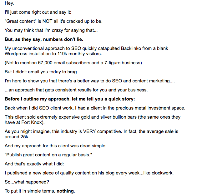
In a different context — like a more traditional media outlet (think the New York Times) – conversational copywriting may be read as sloppy and unprofessional. A casual approach to copy may be a great way to create a connection with the user, but in some contexts, it might only serve to alienate those who are expecting a little more narrative.
Long-form
Long-form copy is another type of copywriting that is an excellent way to convey information with depth and body — to tell a story or to explain something more complex. That’s not to say that long-form copy cannot establish a connection with the user like conversational copy. In fact, quite the opposite. Longer passages are sometimes necessary to lay all the information on the table, or to hook a reader with thick description and expressive language. Long-form copy also has fantastic benefits for SEO, if done properly.
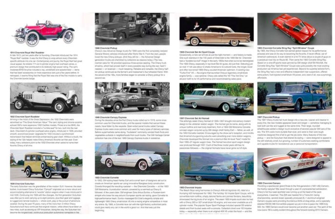
Take, for example, this excellent article from Chevrolet celebrating 100 years of the brand, titled “100 Years of Icons,” an expansive article providing a wealth of historical and in-depth information about each car, while also taking the reader on a journey through the brand’s history.
These are just three approaches to shifting language and style to suit prospective users, though there are many out there to explore.
Spacing
While a slightly more pragmatic element of copywriting, article spacing is another big factor to consider.
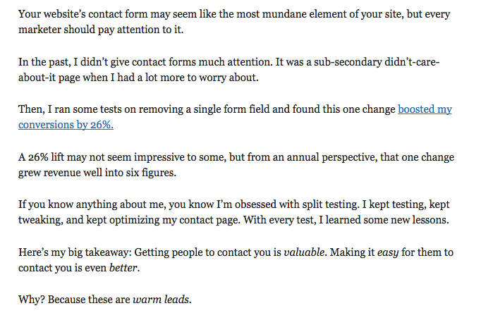
Spacing is contingent on how you want the copy to be consumed, and on the content itself. Take, for example, an article from Neil Patel — one of the world’s most prominent digital influencers.
The main focus of his articles is to convey information to his readers in a highly digestible fashion. Rarely is a sentence longer than two lines, and sometimes they’re as short as two words. The result is content that is very easy to consume, is easy to finish, and to top it off the language is plain and uncluttered.
This is particularly pertinent when it comes to users reading articles on mobile, which completely shifts the user experience. Taking spacing into consideration will ensure heavy chunks of text are avoided, making it easier for mobile users to consume the information at hand.
Patel has a huge audience that consists of content marketing professionals and digital strategists of all levels and from every corner of the commercial world, and he has ensured that his copy reflects this disparity. The user experience of reading a Neil Patel article is one of quick, easy consumption of bite-sized information that is neither too dense nor too lowbrow. And they are gobbled up by his readers:
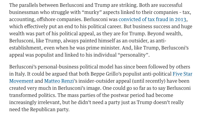
This kind of article, however, you would never expect to find on, say Vice or The Guardian, who are more editorial-focused and tend to lean toward narrative or news-driven content; and as such whose audiences expect more in-depth, long-form copy.
The formatting of these articles reflects these expectations. Passages are long, with thick description and prose that reflects something far more story-like. Quotations are included, as are cultural and historical references.
So, which of the two fosters a better user experience?
Again, that depends on your audience, and what they expect from the content they are reading.
Visual Triggers
Visual triggers play a huge part in copywriting.
It’s all to do with retention. Yes, well done, you have an audience. They want to read what you have to say. But how do you ensure they remain absorbed? How do ensure you get your whole message across? How convert casual users into avid, engaged fans?
You maximize readability with visual triggers.
Bolding and Italics
Visual triggers can be almost anything. And again, the types you use will be dictated by your content and your audience.
For informative copy with multiple points to get across, you want to ensure the reader can scan, scroll and consume in one easy gulp. Triggers in this instance are centered around bolding.
Bold text naturally draws the attention of a reader. Putting keywords and important phrases in bold font ensures that the user does not miss the key points of an article.
Furthermore, they create an air of seductiveness in an article. They are almost addictive, these little nuggets of rich information that can be consumed easily. They make a reader want to read on, and the user experience far more rewarding.
Bolding in an article can be complemented by italics to stress key terms and to bolster the allure of a piece of text, but it is important not to clutter your copy. Use these triggers sparingly and your readers’ user experience will shine.
Quotations
In some copy formats, however, bolding and italics don’t quite fit. Longer, more in-depth copy is more formal and relies on expression, description, and story-telling to enrapture the reader. There are a few things you can do in this style of copywriting to lure the user.
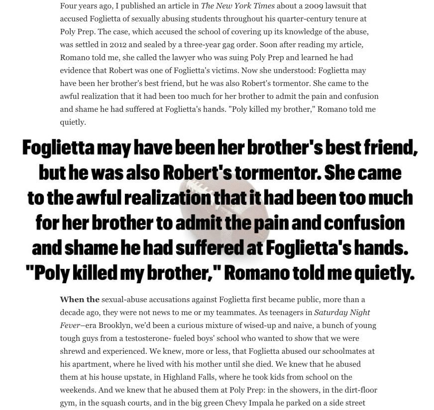
For example, quotations. This is something magazine publishers, who have mastered the creation of compelling long-form articles that beg you to keep reading have long-used. Quotations are a great way to draw intrigue, break up paragraphs, and enrich an article. Whereas long passages can become tiresome, quotations can introduce a different perspective that bolsters your own copy with the opinions of others.
Pull quotes are another good example. This is a classic technique that is less common in digital publishing but certainly growing more popular.
Esquire used this visual trigger to great effect as you can see below:
H2 and Headings
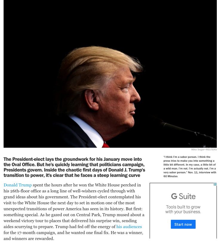
H2 copy is another excellent way to enrich the readability of an article.
An H2 (header) succinctly summarizes a piece of writing, elaborating on the title, and should make the article irresistible to the reader. They also hold great SEO benefits for keyword ranking. H2 copy is larger and bolder than the rest of the copy and is often the first thing a user will read from an article before they dive in. It acts as a compelling abstract and is a great way to urge readers to take the time to consume the entire article.
Headings work in the same way as H2 copy in that they succinctly summarize a portion of the copy, compelling readers to continue on down the page.
For example, take a look at the compelling H2 copy in this article about Trump’s transition to power from Time:
Linking
In these kinds of articles, hyperlinking is yet another excellent way to draw the attention of the reader. Much like bolding, hyperlinks are very eye-catching, but their value is twofold.
Hyperlinking between content is a great way to compel readers to stay on your site — a key factor in driving conversion. Hyperlinking a relevant and provocative snippet from an article to another piece of content will drive readers to delve a little deeper and ultimately spend more time on your site.
These factors are important for SEO too and are simple and effective ways to enrich the accessibility of the content on your site.
Conversion: A User Becomes a Reader
As mentioned, good copywriting isn’t necessarily about poetic prose or dense writing. It’s more about the ability to create an experience for a user.
The basic principles of UX are fairly straightforward, and while the term is more aligned with the realm of design, it is an excellent way to approach copywriting.
Thinking about language, spacing, and visual triggers, the way they interact, and the way they apply to your audience will set you on the path towards creating accessible and rewarding copy.


